Semi-recently, Twitter came out with a cool new music app to discovery new music on (get ready for it) Twitter. They aptly named their new chicklet “#music”. Visually, #music is a very, very cool app. Everything is custom: transitions, collection views, collection view selection animations, media player controls, and one very cool volume slider. If you don’t have an Rdio or Spotify subscription, you probably don’t see anything cool about the media player’s volume slider, but when you have one of the aforementioned subscriptions, the slider turns into a full-on 2-channel equalizer. It’s very cool.
So I had to build it - and now I’m going to show you how I built it so you can build something similar. This isn’t a full-on tutorial, but some generics behind building it with some code samples.
LARSBar
The final product I’ve created is available as LARSBar on GitHub under the MIT license. Ignore the name. Seriously, despite trying to move away from my name as a prefix, my friends at work penned the name for this control when I showed it to them, and I couldn’t come up with anything better.
Design
When I first start a new UI component. I take a step back and look at the big picture of what it is I’m going to be building. This is what we’re going to be building if you haven’t seen the app:
A Screenshot of Twitter’s EQ Volume Slider:

Before I begin, I ask myself a couple of questions to help me plan and not waste time (note this is just implementation, designing a component involves a whole different set of usability questions):
Questions
- What is this piece of UI doing?
- How is this UI going to be used?
- Does this control look like anything that has been done before?
- If yes, can you use that thing to make your life easier?
In our case, this particular piece of UI is going to be both accepting values for the volume from the user (and be able to be set programmatically) and accepting values for the EQ level for two channels. Also, this control looks strikingly similar to your standard UISlider that Apple has already built and extensively tested. So we’re going to try and reuse UISlider in order to make our lives a little easier.
If you look closely at Twitter’s version, I don’t think they are using a UISlider subclass. You can test this by grabbing the slider thumb grabber and moving it slowly back and forth. You’ll notice the slider thumb stutter even when you move it slowly. UISlider does not do that, so we’re going to be using UISlider as our base. UISlider also easily supports customization via UIAppearance. Double-win.
We also don’t need the slider EQ lights to respond to touch, so we are going to use the lightweight CALayer for each of the lights.
Construction Plan
In order to build this tool, there are some basic steps that need to happen in order to make this turn out the way we both functionally and visually want:
- Layout two rows of discrete lights
- Update each individual light based on a “level” property
- Have different “levels” light up each light at a different color
Positioning the Lights
Our first step is to simply layout two rows of lights above and below the slider track. We’ll also need some way to store the layers being used for the lights themselves. We’ll create two storage arrays in order to store our created layers:
1 2 | |
In order to populate and layout our layers, we’ll need to find a mechanism that will allow us to update our layout based on changes of the size of the control. layoutSubviews sounds like a perfect candidate for laying out our lights.
We first need to calculate how many lights that are going to fit horizontally in our layout. To do this, we’ll define a base size for our light layers, then take the width of the control and divide to get how many we need to layout:
1 2 3 4 5 | |
The TOL prefixed variable are constants I have defined to customize the appearance of the control.
This gives us 1. the number of lights being laid out and 2. the actual padding that needs to exist between them. From here we can assign each layer the appropriate frame based on the above information (in this case we’re calculating the center point for each layer):
1 2 3 4 5 6 7 8 9 10 11 12 13 14 | |
The method in this code block sets some properties on the layer based on its position in the array. The only thing it does here for positioning is set the layer’s position property to the center variable fed into the method. Much of what is going on inside layoutLightNumber:center:storageArray:totalLights are performance optimizations that you can check out in the full source if you’re interested.
Building a Light
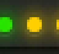
 We have some more requirements for the light itself than we did for the layout. Each light needs to have a different glow color depending on where it is in the x-direction, so it needs to be dynamic. I would also like for the light to animate the change in light color when its state is changed. If you look at the Twitter #music app, you’ll also notice that the base color of the light when it is off is two different colors depending on if it is in front of or behind the slider thumb grabber.
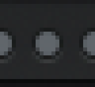
A Screenshot of Twitter’s EQ Slider in the Inactive State:
This would be very difficult and time-consuming to do with assets. So we’re going to build it using CoreGraphics.
CoreGraphics!?
Yes, CoreGraphics. Seriously, don’t run off - it’s going to be fine. Truth be told, I kind of cheated and used PaintCode for my initial graphics code. If you have never heard of PaintCode, go to their site right now and download it. You can get a free trial that will let you use it for a limited time each session, but you can really learn a lot about CoreGraphics just by using the app.
In order to use CoreGraphics with our CALayer light, we’ll be overriding the drawInContext: method. It works exactly like drawRect: with one caveat if you would like to use UIKit methods to draw: you need to manually push the graphics context using UIGraphicsPushContext(ctx).
The light itself consists of three distinct features:
- The inactive light frame
- The inactive light’s base shadow (a 1/2-point down shadow)
- The glow of the light
Each section is neatly commented and laid out for easy consumption:
1 2 3 4 5 6 7 8 9 10 11 12 13 14 15 16 17 18 19 20 21 22 23 24 25 26 27 28 29 30 31 32 33 34 35 36 | |
A bonus for using CoreGraphics in this way with properties on the layer is that CoreAnimation will implicitly animate the change in state (you will most notice this with the glow color of the light). Whenever you change a property that is used to draw the state of the light in the above code, simply call setNeedsDisplay in order to redraw the content.
Remaining Details
This will get you started on implementing a custom EQ slider on your own. The remaining details to make this look like Twitter’s version include changing the color of each light depending on its horizontal position, determining which lights are active based on the position of the slider and optimizing the drawing to only redraw lights that have changed state. I’ll leave this as an exercise to the reader, or you can check out the final product that I implemented with all of the optimizations.
If you’re using LARSBar in an app, drop me a message on Twitter and I’ll add it to the GitHub readme.